![]() July 16, 2014: Here at Didit we work diligently at the intersection of humor and attribution-driven digital marketing. After segmenting many arcane mathematical factors and formulae into proprietary, elite-secret algorithms, the same vastly deep minds that brought you Lame Marketing Phrases 1, 2 and 3 now bring you the 10 types of Linkedin Icons.
July 16, 2014: Here at Didit we work diligently at the intersection of humor and attribution-driven digital marketing. After segmenting many arcane mathematical factors and formulae into proprietary, elite-secret algorithms, the same vastly deep minds that brought you Lame Marketing Phrases 1, 2 and 3 now bring you the 10 types of Linkedin Icons.
Why We’re Doing This
Our Linkedin photo icons are important indicators of our professional identities. They are also the most noticeable, concentrated bunch of pixels on any LinkedIn page. Unfortunately it seems that many LinkedIn users put little thought into their selection. (We originally considered writing a dour and boring article about this subject as it relates to personal branding. But it seemed better to make our point by calling out these common photo icon types. Some are ridiculous, others are outrageous, many are just plain square, but a few of them are provocative in a weird enough way to make a professional point:

The Top 10 LinkedIn Photo Portrait Types

1. The Mugshot: Unfortunately, this is the most common type of Linkedin profile picture. Two mandatory requirements of the “squad room vibe” photo are blandness and lack of emotional affect.
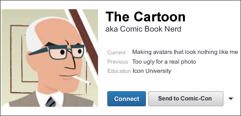
2. The Cartoon: One of our favorites, this indicates a creative, sparking and witty personality who’s decided to cut ties with the real world of sagging skin and sour light.
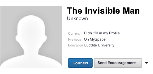
3. The Invisible Man/Woman (profile pic missing) – This enigma seems to be legion on Linkedin. The service doesn’t provide any direct numbers about its Invisible population, but these individuals clearly need help if they ever want to be noticed. In fact, Linkedin has declared that profiles with pictures are 7 times more likely to be looked at than ones without them.
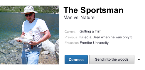
4. The Outdoorsman/Woman (also known as “the Vacationer”). Indicated by color saturation, lens flare, and an all natural background. Such images convey the message: “I’m on a boat that might even be mine.”
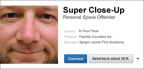
5. The Sergio Leone Super-Close-up: For those of us who wish to be intense. Shades optional.

6. The Overexposed: The lens flare reminds us of a JJ Abrams Star Trek film.
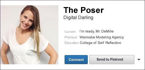
7. The Poser: We find that trying to look cool is better left to Instagram, not Linkedin. A boss or business partner is probably concerned less about your vibe than you are.
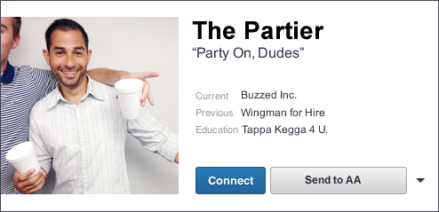
8. The Partier: This is another one whose aesthetics suggest that you don’t want present or future bosses to ever see it.
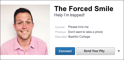
9. The Forced Smile: Try not to look so happy, OK?
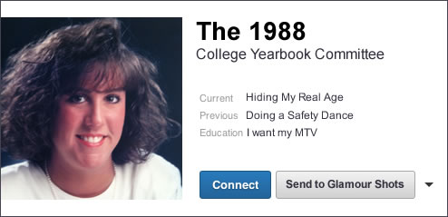
10. The 1988 Graduate: Hint: if you need to put that old Polaroid onto a scanner, you’re probably better off just taking a selfie with your new phone.
Of course, the question remains: “how do I choose a LinkedIn Photo Portrait that will accurately represent me without appearing ridiculous?” We’ll address this question in a subsequent article: in the meantime, if you find yourself in any of the photo icon types below, it’s time to log onto LinkedIn and upload another picture – pronto!
Want to know more about setting up your personal LinkedIn Profile? Check out our e-book: A Simple Introduction to LinkedIn.

- 10 Mistakes to Avoid When Using QR Codes for Marketing - September 20, 2023
- Kevin Lee on How AI Changes the SEO Landscape - August 31, 2023
- The Power of Compound Marketing: Kevin Lee Presents @ 1MediaWorld 2023 Global Conference - March 7, 2023
