 September 8, 2014: We are all conditioned that “seeing is believing” and “statistics don’t lie,” but many infographics — either intentionally or inadvertently — can mislead and deceive.
How does this happen?
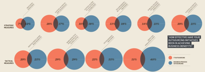
It’s important for a designer to select the right visual elements to make quantitative comparisons easy to understand. In the example below, the designer used Venn diagrams to show a comparison of “IT Outsourcing” and “Business Process Outsourcing.” At first glance these comparisons appear valid, but the sets of circles simply represent percentages and the overlap has no statistical function. In fact, the overlap is just a way of bunching the circles together to compare sizes and save space. Even though each circle is labeled with a percentage, the eye has a hard time judging the relative differences here.
(source: http://mivisualization.com/2014/04/01/why-bars-are-better-than-bubbles/)
Research has shown that bars are better at showing position along a common scale, as in a bar chart.
If we take the same data and place it in a bar graph, it’s much easier to compare the values: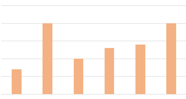
If you design a visualization before correctly understanding the data on which it is based, you face the very real risk of summarizing incorrectly, producing faulty insights, or otherwise mangling the process of disseminating knowledge. Most designers don’t do this intentionally, but with data that isn’t very conclusive it’s easy to sacrifice the truth for the sake of a prettier graphic. This is particularly evident when it comes to political data, as the example below shows:
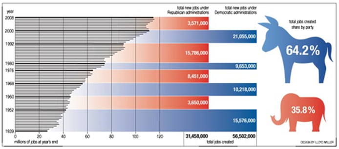
These bars are extremely misleading. They don’t show accurate comparisons on the right end of the graph’s x axis. All the bars end at the same point, despite the varied numbers. Even the party symbols are skewed to show one symbol larger based on a percentage – but the 64.2% symbol should be almost double the size of the 35.8% symbol.
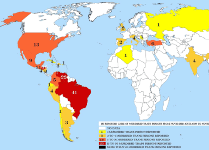
Maps are commonly used to represent geographic statistics, but here they can mislead. This map shows the number of transgendered people murdered over a one-year period. The big problem here is a large portion of the map has no data (white areas) and the data shown is suspect, as there are no ratios to population, or comparisons of other kinds of murders. It doesn’t show any hate crimes either. Context is missing and the process makes light of the crime. (Only 1 murder in all of Russia?)
(source: http://www.smashingmagazine.com/2010/05/10/imagine-a-pie-chart-stomping-on-an-infographic-forever/)
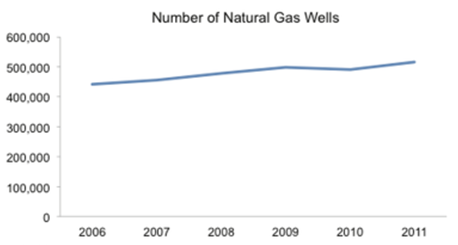
Another way data can be manipulated is through selectively only showing part of the story. According to the infographic, below the United States is clearly producing more natural gas than ever before.
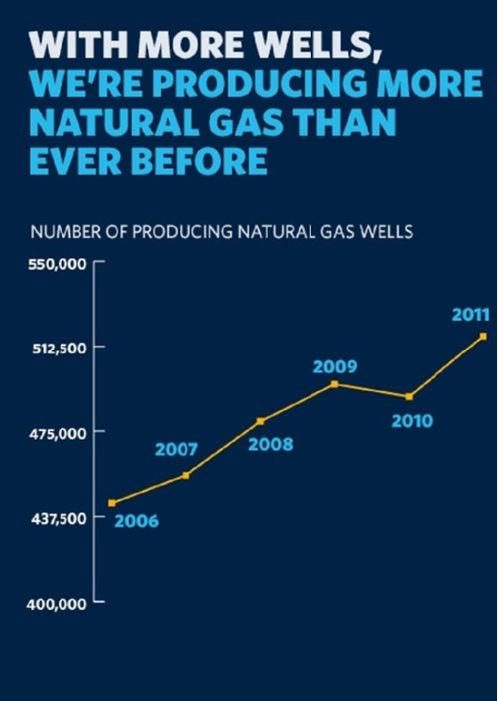
However you’ll see the y-axis doesn’t start at zero. If you compare the two data sets below you’ll see the results aren’t as dramatic when you add the full information in context.
In our fast moving world, many people don’t correctly analyze the infographics as quickly as they may scrutinize false text statements. Make sure all the relevant data is being used, and don’t lose sight of what the “big picture” is. Just as anyone can bring their own “facts” to an argument, they can use the power of persuasive graphic design to propagandize their side of the story.
Have a question about Web Design or Content Marketing? Contact Us.

- 10 Mistakes to Avoid When Using QR Codes for Marketing - September 20, 2023
- Kevin Lee on How AI Changes the SEO Landscape - August 31, 2023
- The Power of Compound Marketing: Kevin Lee Presents @ 1MediaWorld 2023 Global Conference - March 7, 2023